Consultant’s Corner
Site Redesign & Content Migration
Company: Pampered Chef
Date: July 19’
Platforms: Desktop, Tablet, Mobile
Roles: UX Architect, UI Designer, UX Researcher, UX Lead
Business: Direct Sales
Tech: AWS, SAP Hybris, Contentful CMS
Challenge:
This project intended to ease a major pain point for our consultants — finding what they need and when they need it in our consultant back-office tool. This product is where Pampered Chef’s consultants conduct sales activities, as well as educate themselves on how to grow their business.
Previously conducted research and consultant feedback identified the current state of the tool's information architecture was in major disarray and was adding an unnecessary interaction cost for our consultants.
- Research -
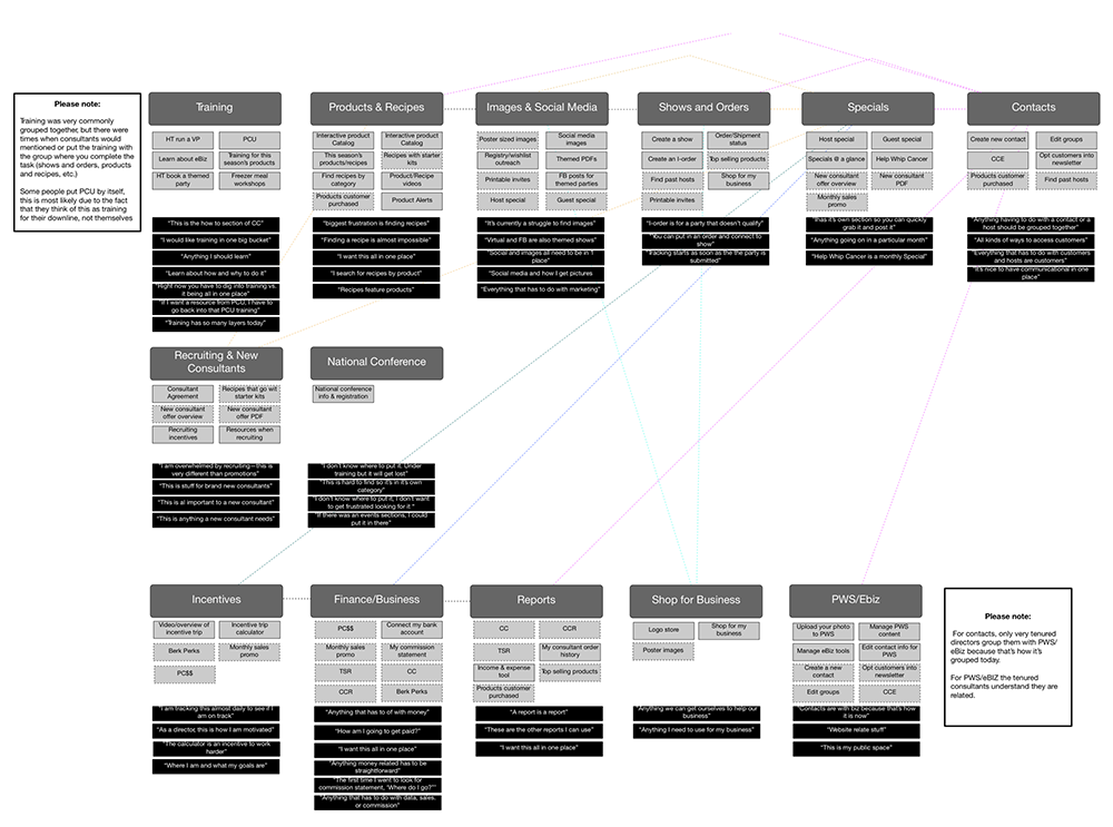
Open card sort activities were conducted with over 40 consultants earlier in the year to yield a better understating of how our consultant's organized content and categories. This work helped shape a better view of our field's mental model when it came to our site's content and tools.
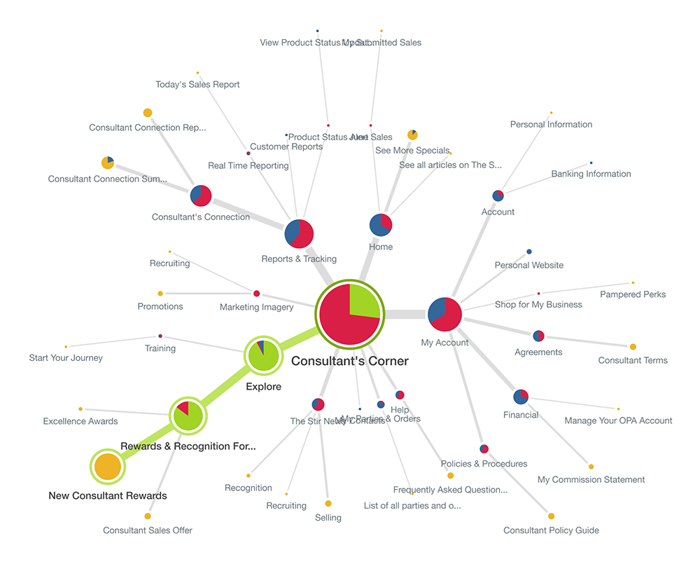
- Site Map -
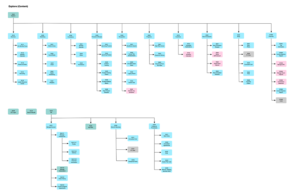
The next step was to take what I learned in the card sort and start mapping out the new architecture of the site. My primary focus was on the human-visible listings, concentrating specifically on the hierarchy structure. This exercise surfaced a bifurcated and flattened out IA. Two main areas of the site started to emerge, the tools to run your business, and the resources to support the growth.
I also incorporated Object-Oriented UX for the site’s content mapping. This would support our user’s mental model while establishing better relationships between objects by developing navigation that was circular and contextual.
- Content Audit -
Once I had a consensus on our approach for the site map, the larger core team moved into the process of performing a content and tool audit on the site. To support a flattened out approach, we needed to eliminate and consolidate our current and future content needs. I conducted our weekly alignment meetings to make sure we were staying on track for our predefined milestones and final release date.
- Tree Testing -
To validate the nomenclature and architecture we were developing, I partnered with our Solution Center and IT Support teams, to review what the hardest tools or content were for our consultants to find. This would also help us understand how they described what they were looking for, so we could build a language to support that.
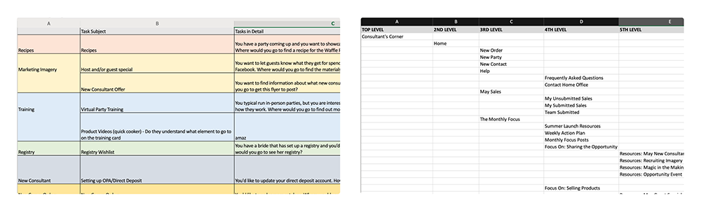
UX research artifacts included a task list and treejack for testing and analysis.
- Tree Testing Analysis -
I ran tests against 3 of our most active segments of consultants. Our participation target was 50 per segment to be statistically significant for each group. We targeted an 80% success rate for all tasks assigned. I also kept in mind that proper UX and design can add a 30% lift to each task's success criteria. I iterated and tested for 2 rounds until I got to our desired 80% success rate.
- Wireframes -
After we mapped out the site, continued working through the audit, and aligned with key business partners, we moved into sketching and wireframing to support the flattened approach to our navigation. I handled designing the tabbed menu on mobile, and our other designer started working through predefined card patterns that would support our approach to eliminating layers in our site’s navigation, as well as establish digital environments or “objects” of content.
- Template Development -
As I continued to work through testing and alignment with key business partners on the audit, I also directed our UX Architects to start providing updated page templates to support the new experience. We utilized an Atomic Design approach to ensure future requests would require a lower level of effort for UI and template development.
- Usability Testing -
Once designs reached a good state for testing, I worked with our team's UX Researcher on conducting RITE method usability studies. Once we hit our predefined testing criteria, we finalized screens for handoff to development.
- High-fidelity Designs -
I and another designer worked through the low fidelity designs to get them to a state of respectable UX and then moved them into a high-fidelity state for handoff to development.
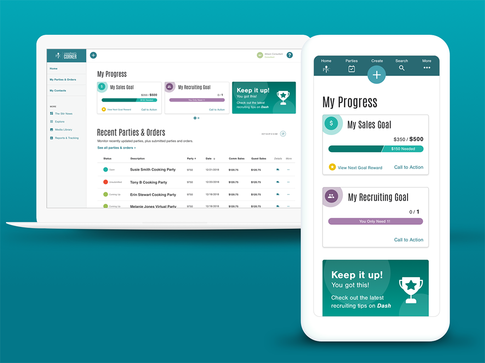
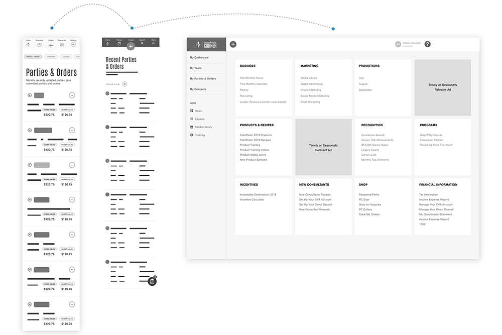
Homepage - Consultants can capture sales, goals, parties, and orders at a glance. Gamification was incorporate through carousel card components at the top to engage and support a newly developed learning management system being launched in parallel with this project.
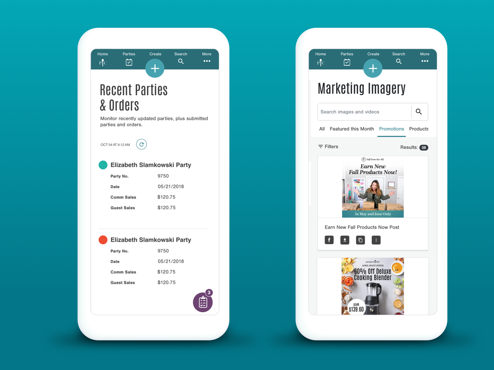
Parties, Orders, and Marketing Imagery - The navigation needed to support current business tools for our consultants, just as much as the content itself. Party and Order Management, on the left, and Marketing Imagery, on the right were two of more utilized tools.
Delineation needed to be well-defined between each of these areas, so the user would understand where they were in the ecosystem of our application at all times. This was accomplished through a clear visual hierarchy of headings, core content, and actionable components.
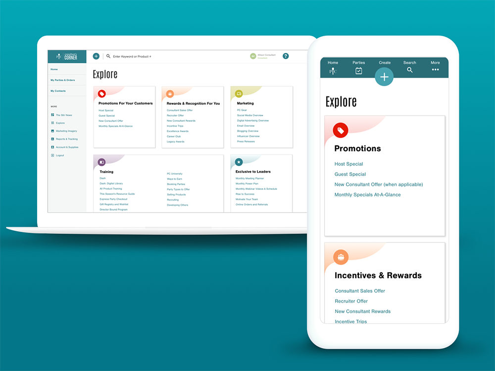
Navigation - Final navigation included a flattened out approach, exposing key objects on card components that also exposed core content and nested objects. Quick access to business resources, reports & tracking, party & order management, and account settings were all part of these main objects to support user mental models and goals.
- Project Results -
The product was launched simultaneously with two other major releases in July of 2019. The work was demoed at National Conference during our Tech Cafe sessions and was immediately applauded.
Achievements:
We saw an immediate lift in consultant productivity. We track this through a KPI of revenue per selling consultant. Our target saw an instant gain to rise above the plan for month-to-date and year-to-date.
Call center volume dropped by over 60% for questions related to the top tasks we had tested against.
Our site's UMUX-Light (Usability Metric for User Experience) score went up 20% for usefulness and 40% for usability, from the previous baseline set before the project.
Lessons:
Communicating and weekly or daily alignment was key for a project this size. A cross-functional, collaborative effort was crucial to be successful.
In the spirit of being agile, we have continued to monitor call logs and adapt the design to accommodate any issues the arise.